How Design Impacts Your Packaging
Wondering just how much impact your packaging has on the retail shelf and more importantly, on the customer’s attention? Is it helping, or hurting, the sales of your product? Enrich has the tools to help.
Let’s assume you have a unique and exceptional product that the consumer will LOVE – just as soon as they try it. But, they’re staring at the store shelf and still don’t see it sitting there. A strong brand is all about recognition and clarity. Your package can have the coolest design on the shelf, but if it doesn’t give the consumer a FAST read on what the product is and the benefits it offers, the design hasn’t done its job.
When Angie Carl, creator of a delicious and healthy coconut butter came to Enrich, her brand was 2 years old and was being sold in grocery stores and online.
While the product was doing relatively well, Angie knew it could be more successful. She was passionate about her product and wanted consumers to understand the real health benefits of this unique coconut butter. Like many entrepreneurs, Angie had a lot of ideas about making changes to the name, logo, flavors and label design. She was also cautious about making a radical change to the design– not wanting to confuse and possibly lose her current customers.
Setting a foundation.
We learned a lot from Angie during several meetings and conducted our own research. To inform and guide brand refresh decisions, Enrich developed a brand platform that captured the essence of who Coconut Kitchen is and defined the market as mostly female, college-educated consumers who self-educate. Her primary customers are health conscious and include body builders seeking to build and retain lean muscle, plant-based/vegans and holistic practitioners that recommend the products to their patients. Based on the core values, key position drivers were established: We believe that no other food on the planet offers the health benefits coconut butter does. Period. Once everyone was in agreement on direction, master messaging and mantra were solidified.
Next, brand tone and attributes were chosen: Our product always comes from a place of pureness and health, with ingredients you know and the least amount of processing possible. Moodboards (shown below) reinforced the brand tone and demonstrated how type, color, imagery and illustration might be used to communicate best to the consumer.
Overcoming a few challenges.
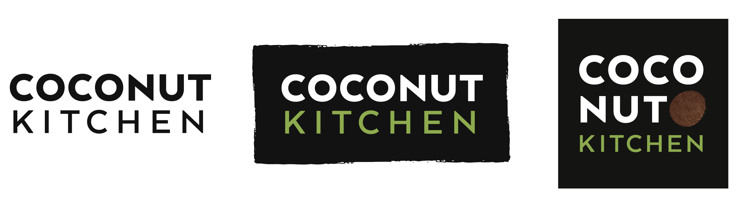
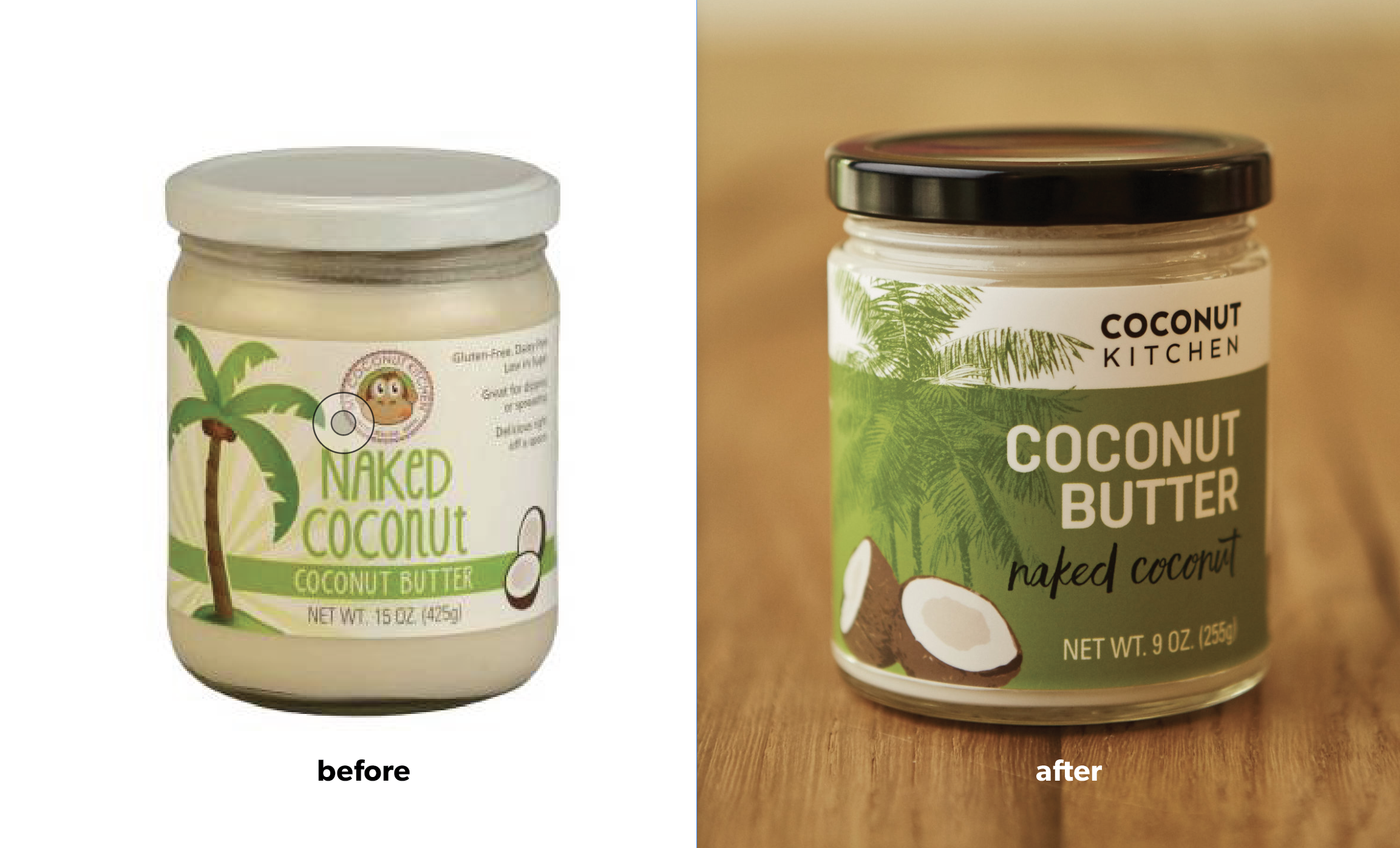
As we developed the new logo, label and website, we had a few things to work through. When looking at the product on the shelf, not all consumers realized what the product was or how to use it. The flavor on the existing label appeared much larger than the product name, which resulted in some confusion. And while the current monkey logo was friendly, it made the product come across as more child-like rather than appealing to the adult market that Angie was targeting. A more sophisticated logo was needed to speak to the right audience and changes in hierarchy would more effectively promote and describe the product.
Because of the high cost of quality ingredients and a time-intensive manufacturing process, each jar retails at $9.00, so the label design also needed to reflect the value of the product.
Originally, Angie had named the company My Coconut Kitchen. After consideration, we decided that keeping “My” in the brand name didn’t add anything, so it was dropped.
While options can be a good thing, in this case there were too many flavors being offered. This made production harder, added to label costs and made inventory more complicated. Because Angie wanted to streamline her offerings, she chose to focus on the five favorite flavors that her customers enjoyed the most.
Developing the refreshed brand.
To replicate the full impact on the retail shelf, a new logo and label design were designed concurrently. A new jar style was chosen and label concepts were evaluated in a store environment.
We adjusted the hierarchy on the label and placed emphasis on Coconut Butter, rather than flavor, which dramatically improved shelf impact and also cleared up customer confusion about what the product was and how it might be used. An extremely legible san serif typeface was paired with a script while a defined color system and palm tree illustration act as unifying elements for the brand language.
The refreshed brand look was then extended to a new responsive product website which features clear messaging and crisp design. This enables the viewer to quickly understand what coconut butter is, its health benefits and the many ways that it might be enjoyed.
Throughout the site, Angie’s story of how coconut butter improved her own health adds a personal touch, allowing her to better connect with her audience. New food photography explains easy and delicious ways to use the flavors and highlights recipes.

Making these strategic changes will enable Angie’s line of coconut butters to grow. She can now speak more clearly about the product to her customer and most importantly, the customer will immediately understand the product and it’s benefits, which is key in today’s competitive marketplace.
Let’s talk about how we can improve your product packaging — and your product sales, with design. Get in touch today!