Helping Others to Understand
130 million Americans—54% of adults between the ages of 16 and 74 years old—lack proficiency in literacy, essentially reading below the equivalent of a sixth-grade level. Often, counties with the lowest literacy rates are the same areas that experience poor health, poverty, and low economic mobility.
– Barbara Bush Foundation for Family Literacy
Basic reading and comprehension skills are a fundamental right of every person. While we may take it for granted that the general population understands what they read – that’s often not the case. Did you know that the average American reads at the 7th- to 8th-grade level according to the nonprofit The Literacy Project? In fact, the American Medical Association recommends that medical information should be provided at no higher than an 8th-grade level.
Individuals with limited literacy skills are not illiterate, or even unintelligent. It’s our role as designers and strategists to make information accessible and easily understood, by engaging the reader with clear content and visuals.
At Enrich, our clients often share complex information – sometimes it’s in medical or highly technical terms that many of us don’t easily recognize. And the more complex it is, the greater the chance that someone won’t understand it.
As designers and strategists, our role is to identify which messages will reach the largest audience and to present them in a way that’s easily understood, with consideration and respect for all. Over the past 20 years, we’ve identified a few tips to make this process easier:
Audience
Know who you’re trying to reach and their level of literacy.
Language
Choose simple vocabulary and write in plain language. This means including words that are clear to most readers, the first time they are read.
Use simple, clear sentences.
Replace difficult words or phases with easier-to-understand ones. If you have to include something complicated or technical, explain it to readers immediately. A reader can’t even try to understand the meaning of a word without some background. You can also offer a simpler alternative in parenthesis.
Try not to be too wordy.
Tone & Context
Write as though you are talking with a friend and keep the tone conversational.
Use an active voice. Lower literacy readers often find it easier to understand the text when it’s clear who is taking the action, or “doing the doing.”
Ex. People eat food (active) vs Food is eaten by people (passive).
Don’t be afraid to read what you’ve written out loud. You may be able to “hear” whether it really does sound conversational and if the messages are easily understandable.
Length
Create materials that share the main message or points quickly and keep in mind how much people will be willing to read.
Keep your text too short. Lower literacy readers can’t absorb too much information at once. They may become easily intimidated and overwhelmed. So, remove non-critical details – or if there’s a larger message to share, break it into multiple documents (or web pages).
Organize the information you want to share into sections and write short, one-topic paragraphs.
Once you have a draft, remove any redundancies and unnecessary words or phrases.
Design & Format
Pay attention to the layout. It’s not all about the writing. Good design visually invites the reader to pay attention to the content, which is important for people with limited literacy abilities. An inviting format reassures them that they can do it.
Start with a logical order. Organize the content so that readers receive the information in an order that makes sense to them and fits their priorities. Tell them from the beginning why the information is important to them.
Use infographics and images to support the text. Visuals can illustrate the content and act as navigational aids.
Include headings and subheadings to create visual hierarchy, organize the text and help readers anticipate what’s coming next. Bullets and numbered lists are great ways to help detailed information stand out.
Introduce white space in the layout to offer visual relief. Choose a clean, uncluttered design to enhance readability.
Choose simple and familiar typefaces. Fancy fonts can be distracting and call attention to themselves rather than to the message.
Use one or two fonts. Too many fonts can make a document look cluttered and create “visual noise.”
Pay attention to the size of the text because it can affect readability significantly. Most readers can read 12-point text but as the size gets smaller, reading becomes increasingly difficult. Don’t use type that is less than 11 points for blocks of text.
Presenting people with clear information that they can absorb empowers them and helps them to understand that they have choices. They are able to weigh their options for a healthier life more easily. Here are a few examples of pieces that we developed to increase understanding with lower literacy audiences.

Rooted Santa Barbara – Nutrition Basics, 1-Pager
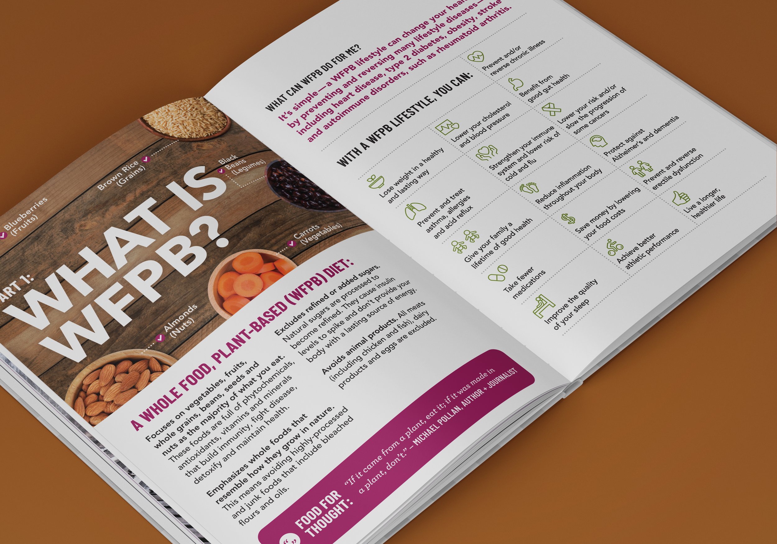
WFPB + ME – Booklet Infographics
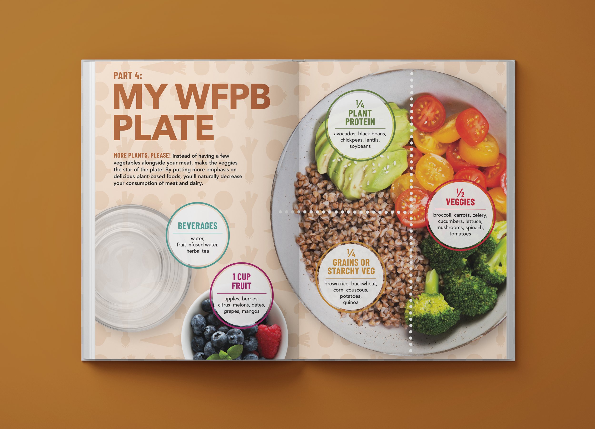
WFPB + ME – Booklet Infographics