Visually Communicate Complex Ideas
We all experience challenges connecting to our audience in the crowded marketplace. Our world is saturated with information, yet we still want to be able to share more. Data guides our decision-making process — we rely on accurate facts to increase understanding and decrease uncertainty. But a piece of information is valueless if, after receiving it, the audience isn’t compelled to respond.
By making use of powerful visual design tools, you can create a breakthrough connection with your audience. Whether it’s an infographic, illustration, book or video — complex and vital information is distilled into useful visualizations, teaching facts about subjects that are meaningful.
If you’re having difficulty reaching your audience, here are three tools that can make it easier to get your message heard, understood and adopted:
1. VIDEO
Videos are an important channel to form a connection with your audience, but then can also to serve as a marketing platform. According to a recent report from Vidyard (a leading video marketing group), more than 70% of marketers say that video produces a better conversion rate than any other type of content. If the subject matter is complex and difficult to explain, a short video can offer a more interesting and successful way to illustrate how things work.
Here are some tips on making a successful video:
Make your visuals the star and show the process, don’t just tell
Include infographics and brief, moving words
Emphasize information with tight shots
Explain the end results at the start of the video and create a call to action
Sample challenge:
You have a complex message that doesn't come across clearly in a presentation or detailed explanation.
How a video solves it:
ICL Food Specialties wanted to showcase their portfolio of products and expertise in ingredient applications, so a video was the perfect tool to accomplish this complicated task. The varying textures in cheeses, spreads, sauces and beverages needed to be demonstrated, so Enrich worked with Once Films to script and create a piece highlighting the “Science of Texture.” Intended for food formulators, the video begins with an infographic and incorporates moving words coupled with close-up imagery, rather than narration, to explain the concepts. This is a perfect example of “show, don’t tell,” and has been well received by the client's Asia, Europe and North and South American markets.
View the Science of Texture video:
2. INFOGRAPHICS
If you’re looking to convey a large amount of complex information, data or knowledge, infographics are another powerful tool to reach your audience effectively. As a visual thinker myself, I like how they can demonstrate an expert understanding of a subject and harness the power of that information. This results in valuable ideas being presented in a clear and appealing way.
Infographics can offer benefits such as:
Expanding brand awareness
Telling a story and creating a more impactful presentation
Increasing web and social media traffic, which expands worldwide coverage
Sample challenge:
You’re a physician who is trying to help patients understand the power of healthy food choices in preventing disease and preserving our environment. Sharing your knowledge in each short visit is difficult — everyone is busy and there’s so much confusing nutritional information available. Patients may also be simply uninformed about the impact of the Standard American Diet (SAD), and how much meat consumption depletes our natural resources.
How infographics can help:
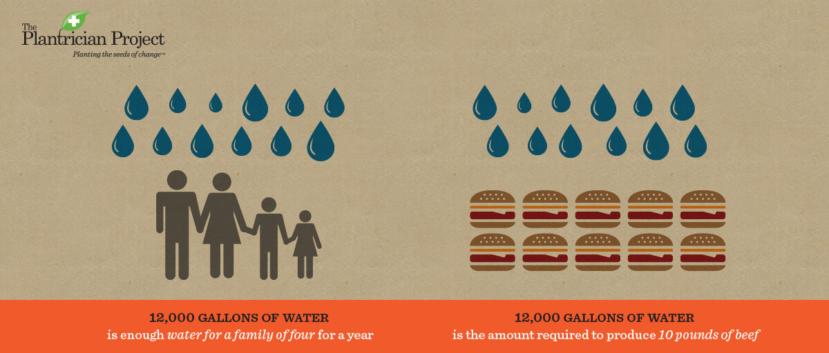
The Plantrician Project's Quick Start Guide and Food Math 101 are resources that physicians can provide to their patients in a clear format — with scientifically-proven research that a doctor can trust. Three infographics get the facts across visually through comparisons: Did you know the SAD diet takes 2 football field sized acres of land to feed one person annually, where a plant-based diet feeds 14 people on the same size plot of land? Did you know it takes 12,000 gallons of water to produce 10 pounds of beef, and that same amount of water is what a family of four uses per year? Depicting these compelling facts in images creates impact.
Other great infographic examples include: The New York Times // Good Magazine // National Geographic
3. BOOKS AND IPAD APPLICATIONS
Books are valuable tools to educate your audience, especially when they offer a unique viewpoint, tell a great story and are visually creative. They allow the reader a chance to absorb well-organized content, at their own pace. If you’d prefer to reach them in a faster manner, consider an iPad application. When designed in a fun and creative way, an iPad app can instantly engage the audience, spread through word of mouth and share your message with a larger crowd.
Sample challenge:
You’re a parent who is having a difficult time instilling healthy eating habits in their children.
How a book and iPad app solve this challenge:
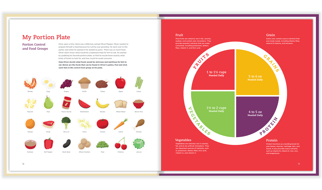
With the right set of tools, kids can get involved in learning about food in an interactive way. My student, graphic designer Tiffany Hill recently created a self-published activity book and iPad application that teaches families how to eat healthy together. Since childhood obesity is on the rise, Tiffany felt it was important to create Once Upon a Pantry as a tool to help families understand the basics of making healthier food choices.
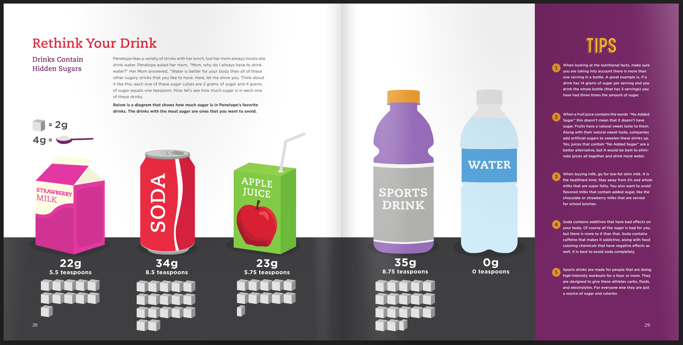
The story is about Oliver and Penelope Pepper, who try a series of activities to learn about healthy eating along with the reader. For example, the Pepper family plays a shopping game, choosing between wholesome and unhealthy grocery store items in “My Healthy Cart.” “Yummy Tasting Party”is a points-based game about trying new things and rating their taste. “Rethink Your Drink” gives tips on hidden sugars in beverages, so kids learn why soda is a poor choice. When Once Upon a Pantry was tested in a group of children, it was met with great success. The kids were very enthusiastic to try foods they wouldn’t touch before!
View a demo of the Once Upon a Pantry iPad app:


